Overview
Levi’s as well as many of the competitors in retail space have been heavily utilizing promotion to boost sales. Though Levi’s E-comm business has been growing strong with this strategy, we started to see a surge of customers’ complaints on promo issues. Users weren’t sure if certain promotions were applied and why some products weren’t eligible. Over the course of a couple of months, I redesigned a new promotion experience on mobile, tablet, and desktop web in collaboration with 2 PMs, 1 researcher, 2 marketers, 1 data scientist, and 3 engineers.
Role
Product Designer
Duration
Feb - May 2019
Tools
Sketch, Principle
Problem
Records have shown that Levi’s ran year-round promo except for 5 days in a calendar year on e-commerce. With this heavy marketing strategy, our data showed that 30% of our orders are placed with discount code. However, at the same time promo related issues have risen up as the #1 customer complaints at our US Customer Service Center.
User Problem
Users don’t know why promo didn’t apply.
Users don’t know why certain products didn’t apply for a promo.
Business Problem
Users leaving the site to hunt for promo code resulted in an increase in cart abandoned rate and higher cost for Google Search Engine Marketing.
Users calling agents for help caused higher costs for our customer service.
Discovery
We uncovered a lot of useful insights from customer service scripts, web analytics, previous user research, and white papers.
Summary
Code Typo: Users had promo code typos.
📊 Take code LETSGO for example, 4.4% entered “letgo”, 2% entered “let’s go”, 1.8% entered “lets” among all the invalid codes entered by users.
Exclusion: Users didn’t know why certain products were not eligible for promos.
Expiration: Users got confused when entering an expired code but getting feedback saying the code was invalid.
Discount: Users want to know how much they save in total and for each item.
Analysis & Assumptions
I did an audit of our site to further understand where do we communicate promo and why the current experiences are causing issues to the users.
Problem Statement
How might we communicate better on promo expiration, exclusion and make it easy for users to apply promo code?
Ideation
I explored interaction models for tapping to apply which allows users to easily apply promo code without typing the code. I also wireframed several feedback messages design which came down to the idea of contextual help: keep users informed anytime and give users a way to troubleshoot.
Iteration and Validation
With several rounds of team alignment, we decided to move forward with two candidates for user testing.
Option 1: a list view of promo code in cart
Option 2: similar to current design with a text link in cart, once clicked, it’ll open a detailed modal, and the users can then scroll through all the different promos and tap to apply from there.
User Testing
8 (4F/4M) sessions on usertesting.com.
We tested out mobile version as 70% of our traffic is from mobile.
Questions
Option 1 or Option 2?
Is “tap to apply” understandable?
How do people see promo code?
Results
6/8 participants choose option 1.
All of the users can easily tap to apply promo code.
6/8 participants answered that they always try to find a promo code or discount before making a purchase online.
4/8 participants answered that after seeing the display of promo code in the shopping bag, they won’t go to other websites to search for promo codes.
1/8 participants called out that it’s a little bit overwhelming to see a list of promotions.
1/8 participants called out it’ll be beneficial to direct them to sections displaying items that are available for certain promo when the order has not yet qualified to it.
Quotes
“I feel great about the brand being transparent on promotion. It’s a great service.”
— Feedback from Option 1
“I probably wouldn’t get 20% Off. Feel like you’re hiding the promo away from me to use it”
— Feedback from Option 2
Polish
I iterated on options 1 to address issues and opportunities that identified from user testing.
Summary of changes:
Use cards with horizontal scrolling.
Improve functionality for contextual help.
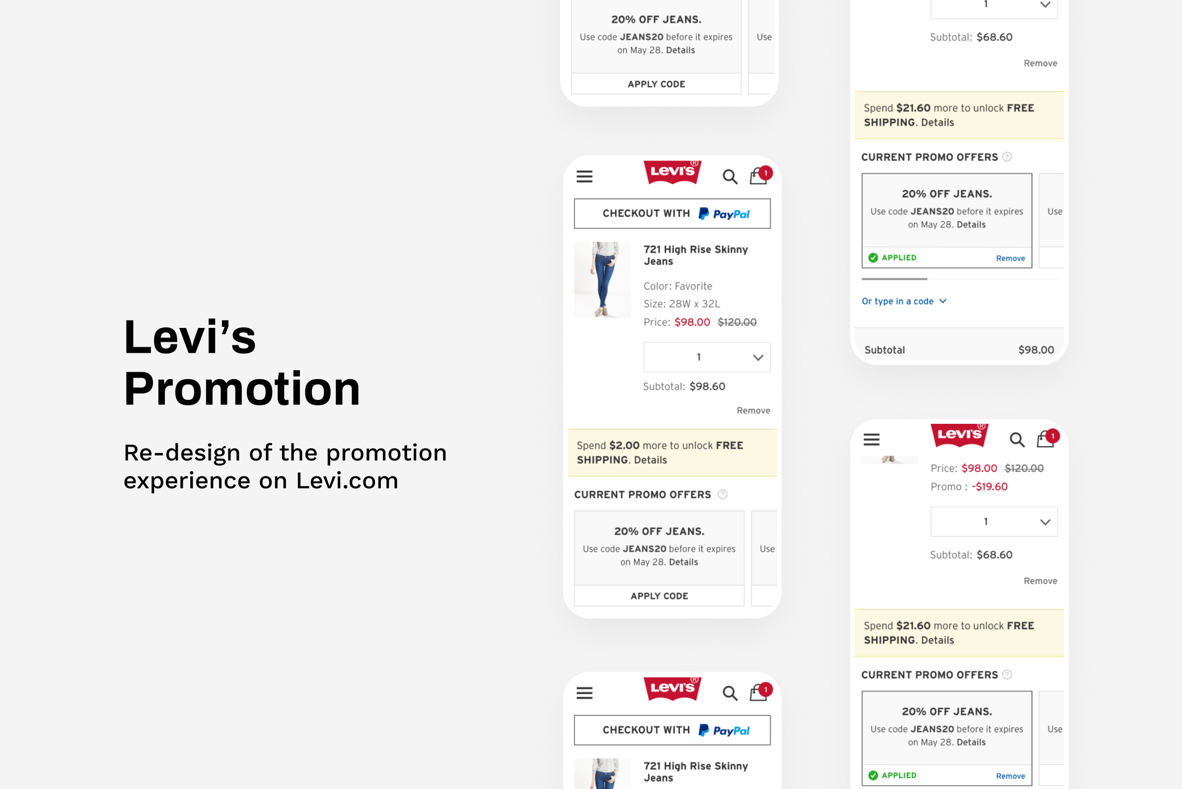
New Promo Experience
Easy to apply and browse promos.

Contexual Help
Feedback Messages that are clear and suggest you how to resolve the problem.

Default Promo Card

Tooltip

Applied Promo Card
Metric
We ran A/B testing for 10 weeks(Jan to March 2020) to validate the design.
75% increase for visits that successfully apply promo code compared to control.
Conversion rate is flat compared to control.
Conclusion
We successfully launched the contextual help feature while still evolving the design as we’re currently working on re-designing our E-commerce with a new and elevated design system. Stay tuned…