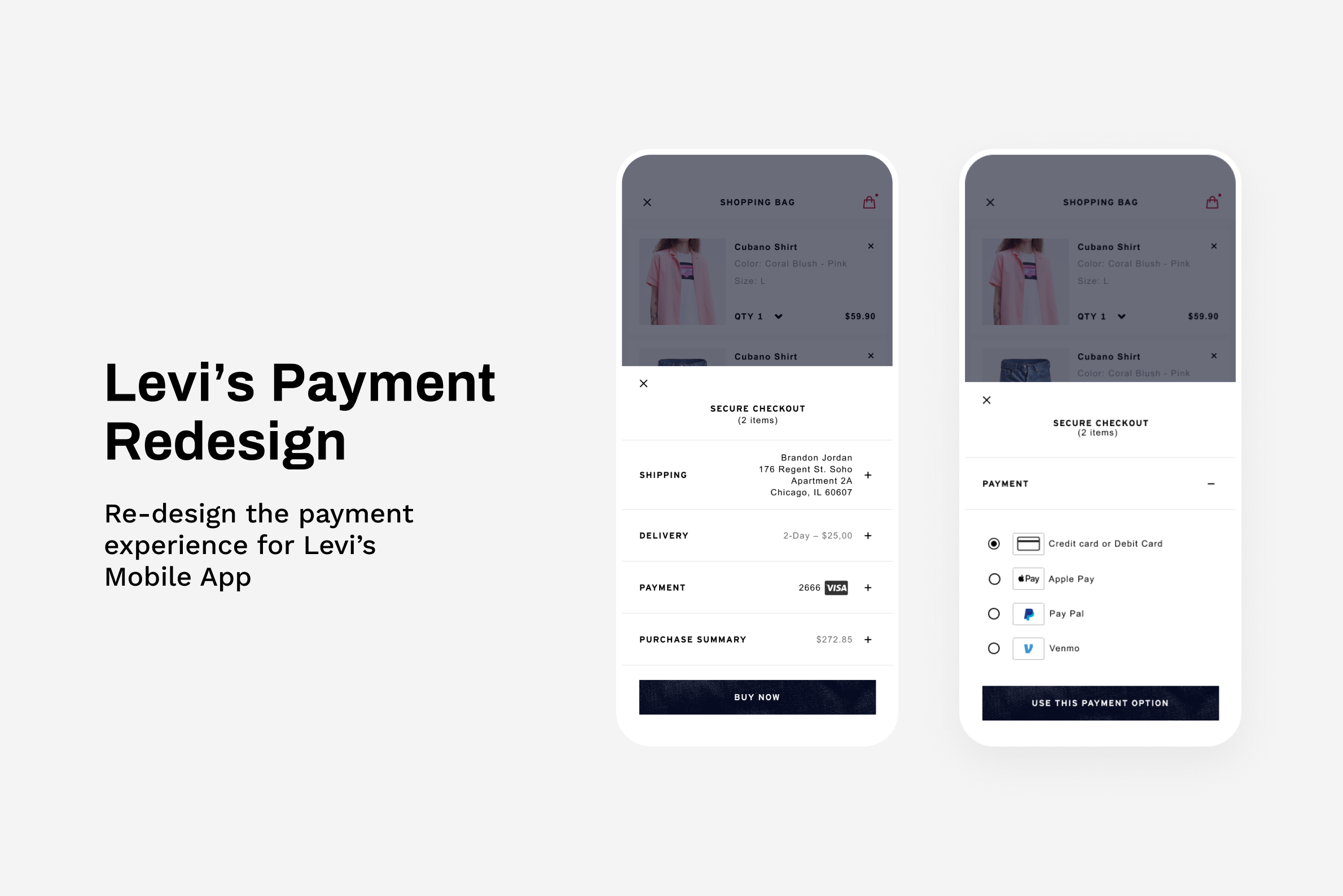
Overview
Checkout has always been a cumbersome experience for online shoppers, especially in the payment step. To help users pay with ease and confidence, we constantly add new payment options in the checkout process to ensure every user can find their preferred payment methods. I was originally tasked to design the experience for our new payment type “Venmo”, but soon found out that our existing design pattern was not scalable and had an inconsistent UI that created a fragmented user experience. As a result, I took on the lead to redesign the payment experience in collaboration with 2 product managers, a user researcher, and our engineer teams.
Role
Product Designer
Duration
1.5 months
Tools
Figma, Protopie
Understand
Problems
User Problem
For people checking out on Levi’s, paying is a frustrating experience due to inconsistent UI and inflexibleness of managing payments.
Business Problem
Not scalable UI - The existing UI is not scalable to accommodate new payment types.
High engineering costs – 2 different UI for the saved card and non saved card scenarios were expensive to maintain for the business.
Discovery
📝Research Insights and UX audit
Users are confused by the copy of the call to action and the number of buttons to choose from.
Inconsistent UI for users who have saved payments and those who don’t.
No way for users to remove and edit a saved payment.
Users appreciated the variety of payment options, especially the methods that required users to extend minimal effort to complete the purchase(Apple pay, Paypal)
📊Data Analytics
Most users use credit cards and Paypal as payment options.
2% of users pay with their saved cards, among these people, 2% of them have more than 1 card.
Iteration and Validation
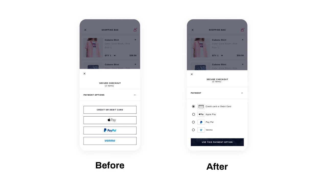
Iteration 1 - Reusing the existing design pattern
By reusing the existing design system, I quickly put together the first iteration with the newly added payment type ”Venmo”. After seeing this version, I realized that our existing design system is not a scalable solution in the long run because we will at least have 4+ buttons in the payment section as part of this project to add Venmo as additional payment options. In addition, the existing design pattern does not support the use cases for removing payments, the visual treatment looks out of space and the design for saved 3rd party payments is different from the design for the saved card.
To convince the product/dev team to commit to redesigning the entire payment section, I initiated the communication with the key stakeholders to showcase this “not-working design” and called out scalability concerns and usability issues. After several meetings, the team finally agreed to redesign the payment section as part of the Venmo projects.

Iteration 2 - Testing out 2 directions(Scalability vs. Clarity)
After getting the team’s alignment, I started to explore the different design solutions and finally landed on 2 directions to test out with users.
Option A
👍 Pros: See all the available payments all at once.
👎 Cons: Not as scalable as option B.

Option B
👍 Pros: Fewer options at a glance, better scalability than option A
👎 Cons: Not able to see all the payment options at a glance.

Validation
To validate the 2 directions, I created hi-fidelity prototypes, wrote research scripts and ran a randomized tests to gather user insights. The results are as follows:
6/6 users rated option A as very easy to use in a 5 point Likert Scale(1: very difficult → 5 very easy).
5/6 users rated option B as very easy to use, 1/6 rated option B as neutral.
6/6 users choose option A when asking which designs they prefer.
Final Design
The final design has a consistent UI regardless if you have saved payments or not.
The listview UI is scalable to accommodate new payments type and leave room for edit/remove features if the payment options offer.
View all available payments
Simple and easy to choose between payment methods
Easy Access to Saved Payments
The most recent used payments will show up at top
Results
A scalable UI Pattern for payment - The new UI pattern can scale well with new payment options.
Improved experience - 100% of test participants reported the payment flow as very easy to use in a 5 point Likert Scale (1: very difficult → 5 very easy).
Shorter time to checkout - The task completion time for checkout reduced by 20%.